Typography/ Final Compilation & Reflection
15.07.2024 - 21.07.2024 / Week 13- Week 14
Lim Pei Jiun (0372548)/ Bachelor of Design (Honour) in Creative MediaTypography/ Taylor's University
Final Compilation & Reflection
INSTRUCTIONS
Task 1/ Exercises
22.04.2024 -26.05.2024 / Week 1- Week 5
Exercise 1: Type Expression

fig 1.1 Type Expression (JPEG)
fig 1.2 Type Expression (PDF)

Exercise 2: Text Formatting

Fig1.4 Text Formatting Final (JPEG)
Fig1.5 Text Formatting Final (PDF)

Fig1.6 Text Formatting Final with Grid (JPEG)
HEAD LINE
Font/s: Bembo Std
Type Size/s: 72 pt
Leading: 36 pt
Paragraph spacing: 0
Font/s: Bembo Std
Type Size/s: 72 pt
Leading: 36 pt
Paragraph spacing: 0
BODY
Font/s: Bembo Std
Type Size/s: 9 pt
Leading: 11 pt
Paragraph spacing: 11 pt
Characters per-line: 57
Alignment: left justified
Font/s: Bembo Std
Type Size/s: 9 pt
Leading: 11 pt
Paragraph spacing: 11 pt
Characters per-line: 57
Alignment: left justified
Margins: 123 mm top, 26 mm left + right + bottom
Columns: 2
Gutter: 10 mm
Columns: 2
Gutter: 10 mm
Task 2/ Typographic Expression & Communication
27.05.2024 - 14.06.2024 / Week 6- Week 8

Fig2.2 Task 2 Final Outcome (PDF)

Fig2.3 Task 2 Final Outcome with Grid (JPEG)
Font size: 12pt
Line Length (50–60 characters)
Text Leading: 14pt
Paragraph spacing: 12pt
Alignment: left alignment
Task 3/ Type Design & Communication
19.06.2024 - 15.07.2024 / Week 9- Week 12


fig3.2 Final Task 3: Type Design (JPEG)
fig3.3 Final Task 3: Type Design (PDF)
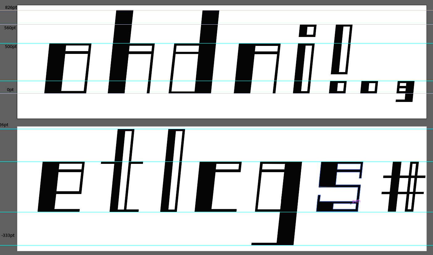
fig3.4 Final Task 3: Type Design (Guides)

fig3.6 Final Poster (PDF)
REFLECTION
Experience
This assignment has taught me more about typography. I had no idea there were so many differences between fonts before this. From the first class of blog creation to the last class of fontlab, everything was my first contact. So of course I encountered many difficulties, but fortunately I had the help of the lecturer and classmates. Besides, I got hands-on experience with several software, such as AI, PS and InDesign. These software will be very helpful for my future.
Observation
I observed that fonts are very strict. The size and angle of the fonts most be consistent, and there is also a set standard for the distance between the fonts. For me, designing fonts is not very difficult. The difficulty lies in keeping the angles of all fonts consistent when digitizing. I made repeated adjustments on this step. Moreover, typographic expression attaches great importance to neatness, which can be seen in the distance between paragraphs and the word limit of each line,
Findings
I discovered the fun of fonts. You can design fonts in all kinds of ways, just use your imagination, but no matter how you design them, they must remain unified. The collision between the bizarre designs and the rigorous unity is both contradictory and harmonious, which I find interesting. Through this assignment, I have fully improved myself and can get started with those software more quickly. I also understand the importance of feedback. The lecturer's feedback can help us complete the assignment better.

Comments
Post a Comment