Typography Task 2/ Exercise
27.05.2024 - 14.06.2024 / Week 6- Week 8
Lim Pei Jiun (0372548)/ Bachelor of Design (Honour) in Creative MediaTypography/ Taylor's University
Task 2: Exercises
TABLE OF CONTENTS
LECTURES
The lectures of Week1-Week4 is at Task 1
Week 5: Letters
Understanding Letterforms
The uppercase letter forms bellow suggest symmetry, but in fact it is not symmetrical. More noteworthy is the fact that each bracket connecting the serif to the stem has a unique arc
The uppercase letter forms may appear symmetrical, but a close examination shows that the width of the left slope is thinner than the right stroke
The complexity of each individual letterform is neatly demonstrated by examining the lowercase 'a' of two seemingly similar sans-serif typefaces, Helvetica and Univers. A comparison of how the stems of the letterforms finish and how the bowls meet the stems quickly reveals the palpable difference in character between them
Maintaining x-height
The x-height generally describe the size of the lowercase letterforms. However, curve strokes, such as in 's', must rise above the median (or sink below the baseline)
Form / Counterform
When letters are joined the form words, the counterform includes the space between them. How well you handle the counters when you set type determines how well words hang together
One of the most rewarding way to understand the form and counter a lrtter is to examine them in close detail. The examinations also provide a good feel for how the balance between form and counter is achieved and a palpable sense of letterform's unique characteristics
Contrast
Week 6: Typography in Different Medium
Good typography and readability were the result of skilled typesetters and designers
Print Type vs Screen Type
Primarily, it's the designer's job to ensure that the text is smooth, flowing, and pleasant to read
A good typeface for print-Calson, Garamond, Baskerville are the most common typefaces that is used for print. They are versatile, easy-to-digest classic typeface, which has a neutrality and versatility that makes typesetting with it a breeze
Typefaces intended for use on the web are optimized and often modified to enhance readability and performance onscreen in a variety of digital environments
Another important adjustment - especially for typefaces intended for smaller sizes - is more open spacing. All of these factors serve to improve character recognition and overall readability in the non-print environment, which can include the web, e-books, e-readers, and mobile devices
Fig1.2 Screen Type
Hyperactive / hyperlink
A hyperlink is a word, phrase, or image that you can click on to jump to a new document or a new section within the current document. Text hyperlinks are normally blue and underlined by default. When you move the cursor over a hyperlink, whether it is text or an image, the arrow should change to a small hand pointing at the link
Font Size for screen
16-pixel text on a screen is about the same size as text printed in a book or magazine; this is according for reading distance. If you were to read them at arm's length, you'd want at least 12 point, which is about the same size as 16 pixels on most screens
System Fonts for Screen / Web Safe Fonts
Each device comes with its own pre-installed font selection. Which is based largely on its operating system
Are Open Sans, Lato, Arial, Helvetica, Times New Roman, Times, Courier New, Courier, Verdana, Georgia, Palatino and Garamond.
Pixel Differential Between Devices
The screens used by our PCs, tablets, phones, and TVs have different sizes and the text you see on-screen differs in proportion too. This is because they have different sized pixels
Static vs Motion
Static typography has minimal characteristic in expressing words. Traditional characteristics such as bold and italic offer only a fraction of the expressive potential of dynamic properties
Motion typography, temporal media offer typographers opportunities to "dramatize" type, for letterforms to become "fluid" and "kinetic"
INSTRUCTION
EXERCISES
Task 2: Exercises 1- Text Option
Research:
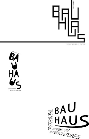
After choosing the tittle, I start to do research at Pinterest and design some fonts related to Bauhaus.
Fig2.4 Tittle (after adjust)
After giving Mr Goh choose, I used tittle1 and tittle2 to do the layout
Font size: 12pt
Line Length (50–60 characters)
Text Leading: 14pt
Paragraph spacing: 12pt
Alignment: left alignment
FEEDBACK
Week 6
General Feedback
Choose one of three tittles and do 3 sketches
Specific Feedback
The tittle should not be too simple, can add some Bauhaus elements at the tittle
Week 7
General Feedback
Do digitalize at Illustrator and do layout at InDesign
Specific Feedback
"The role of" on tittle1 can be more coarse. The position of the Bauhaus on tittle2 could be adjusted a little more
REFLECTIONS
REFLECTIONS
Week 6:
Experience: We learn how to design a title for related content for a title
Observation: Some people are finishing their Task1. For those who already finish, start choose one of the three titles to do 3 sketches
Findings: It has exercised my creativity
Week 7:
Experience: We learn how to digitalize the sketches at Adobe Illustrator and do layout at Adobe InDesign
Observation: On online class, Mr. Goh helped us solve the problems one by one
Findings: I can use AI and InDesign more proficiently
FURTHER READING
typography design: Form and Communication
I continued reading this book
The chapter examines the fundamentals of typography, focusing on letterforms, nomenclature, measurement, and font characteristics. It highlights the alphabet as a sequence of visual signs representing sounds, with 26 characters combining into numerous words.
The proportions of letterforms are crucial in typography. Expanded and condensed styles show how width affects design.


Comments
Post a Comment