Typography Task 1/ Exercise
22.04.2024 -26.05.2024 / Week 1- Week 5
Lim Pei Jiun (0372548)/ Bachelor of Design (Honour) in Creative Media
Typography/ Taylor's University
Task1: Exercises
TABLE OF CONTENTS

 Fig3.1 'Pilcrow' ( ¶ )
 Fig3.2 'Line space' (leading*)
 Fig3.3 Standard indentation


 Fig3.6 Examples
Headline within Text
 Fig3.7 'example A'
 Fig3.8 'example B'
 Fig3.9 'example C'


INSTRUCTIONS
Task1: Exercises1- Type Expression

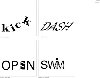

Fig5.4 dash anime


Fig5.11 final layouts with grids- PDF
FEEDBACK
REFLECTIONS
FURTHER READING

Lim Pei Jiun (0372548)/ Bachelor of Design (Honour) in Creative Media
Typography/ Taylor's University
Task1: Exercises
TABLE OF CONTENTS
1. Lectures
2. Instruction
4. Feedback
5. Reflections
LECTURES


 Fig1.5 uncials
 Fig1.6 half-uncials
 Fig1.7 Blackletter (textura)
 Fig1.7 Blackletter (Gutenberg)


Type Specimen Book
Week 1: Introduction and Briefing
Introduction
Font: A single font or weight in a font
Typeface: Entire family of fonts/weights that share similar characteristics/styles.
Development
Phoenician like other Semitic people, wrote right to left. The Greek developed a style of writing called 'boustrophedon', which meant that the lines of text read alternately from right to left and left to right.

Fig1.1 'boustrophedon' style

Fig1.2 early letterform development
Hand Script from 3rd - 10th CE:
Square capitals have serifs added to the finish of the main strokes. The variety of stroke width was achieved by the reed pen held at an angle of approximately 60 degree off the perpendicular.

Fig1.3 square capitals
Rustic capital allowed for twice as many words on a sheet of parchment and took far less time to erite. Although rustic capitals were faster and easier to write, they were slightly harder to read due to their compressed nature.

Fig1.4 rustic capital
Uncials incorporated some aspects of the Roman cursive hand. It simply as small letters. The broad forms of uncials are more readable at small sizes than rustic capitals.

Half-uncials is a further formalization of the cursive hand, mark the formal beginning of lowercase letterforms.

Blackletter or textura gained popularity in northern Europe. In the south, a rounder more open hand gained popularity, called 'rotunda'.

Blackletter of northern Europe type mold required a different brass matrix, or negative impression, for each letterform.

Timeline
Humanist script to roman type
1460: Lucius Lactantius, Venice
1471: Quintillian, Nicholas Jenson, Venice
1472: Cardinal Jonannes Bessarion, Conred Sweynheym and Arnold Pannartz, Subiaco press, Rome
Venetian type from 1500
1499: Colona, type by Farncesco Griffo
1515: Lucretius, type by Farncesco Griffo
The Golden Age of French printing
1531: Illustriddimae Galliaru reginae Helianorae, printed by Robert Estianne, Paris. Type-cast by Claude Garamond
1572: Polygot Bible (Preface). Printed by Christophe Plantin, Antwerp
English type from the eighteen century
1734: William Caslon. Type specimen sheet, London
Baskerville's innovations
1761: William Congreve, typeset and printed by John Baskerville, Birmingham
1818: Giambatista Bodoni. Manuale Tipografico, Parma
Week 2: Text (Part 1)
Kerning and letterspacing
Kerning refers to a automatic adjustment of space between letters. Letterspacing means to add space between the letters. The addition and removal of space in a word or sentence is referred to as tracking.

Fig2.1 Kerning and letterspacing
Formatting Text
Flush left: Each line starts at the same point but ends wherever the last word on the line ends. Spaces between words are consistent throughout the text, allowing the type to create an even gray value.

Fig2.2 Flush left
Centered: This format imposes symmetry upon the text, assigning equal value and weight to both ends of any line.

Fig2.3 Centered
Flush right: This format places emphasis on the end of a lines as opposed to its start.

Fig2.4 Flush right
Justified: Like centering, imposes a symmetrical shape on the text.

Fig2.5 Justified
Leading and Line Length
Type size: Should be large enough to be read easily at arms length
Leading: Text that is set too tightly encourages vertical eye movement; a reader can easily loose his or her place. Type that is set too loosely creates striped patterns that distract the reader from the material at hand
Line Length: Appropriate leading for text is as much a function of the line length as it is a question of type size and leading. A good rule of thumb is to keep line length between 55-65 characters.
Text should create a field that can occupy a page or a screen. Think of your ideal text as having a middle gray value, not a series of stripes.

Fig2.6 sample type specimen book sheet
Week 3: Type (Part 2)
Indicating Paragraphs
'Pilcrow' ( ¶ ), a holdover from medieval manuscripts seldom use today

'Line space' (leading*) between the paragraphs, can ensures cross-alignment across columns of text.

Standard indentation have the same size of the line spacing or the same as the point size of your text

Windows and Orphans
A window is a short line of type left alone at the end of a column of text.
An orphan is a short line of type left alone at the start of new column.

Fig3.4 Windows and Orphans
Highlighting Text

Fig3.5 Examples of how to highlight text within a column of text
When highlighting text by placing a field of colour at the back of the text, maintaining the left reading axis

- Place typographic elements outside the left margin of a colomn of type to maintain a strong reading axis
- Quotation marks, like bullets, can create a clear indent, breaking the left reading axis. Compare the indented quote at the top with the extended quote at the bottom
In the following visuals these have been labeled (A, B and C) according to the level of importance.
'A' head indicates a clear break between the topics within a section. In the following examples 'A' heads are set larger than the text, in small caps and in bold. The fourth example shows an A head 'extended' to the left of the text

'B' head here is subordinate to A heads. B heads indicate a new supporting argument or example for the topic at hand. As such they should not interrupt the text as strongly as A heads do

'C' heads, not common, highlights specific facets of material within B head text. They not materially interrupt the flow of reading. As with B heads, these C heads are shown in small caps, italics, serif bold and san serif bold

Week 4: Basic
Describing Letterforms
- Baseline The imaginary line the visual base of the letterforms
- Median The imaginary line defining the x-height of letterforms
- X-height The height in any typeface of the lowercase 'x'
- Stroke Any line that defines the basic letterform
- Apex / Vertex The point created by joining two diagonal stems (apex above and vertex below)
- Arm Short strokes off the stem of the letterform, either horizontal (E, F, L) or inclined upward (K, Y)
- Ascender The portion of the stem of a lowercase letterform that projects above the median
- Barb The half-serif finish on some curved stroke
- Beak The half-serif finish on some horizontal arms
- Bowl The rounded form that describe a counter. The bowl may be either open or school
- Bracket The transition between the serif and the stem
- Cross Stroke The horizontal stroke in a letterform that joins two stems together
- Crotch The interior space where two strokes meet
- Ear The stroke extending out from the main stem or body of the letterform
- Em/en Em is now the distance equal to the size of the typeface. An en is half the size of an em.
- Finial The rounded non-serif terminal to a stroke
- Leg Short stroke off the stem of the letterform, either at the bottom of the stroke (L) or inclined downward (K, R)
- Ligature The character formed by the combination of two or more letterforms
- Link The stroke that connects the bowl and the loop of a lowercase G
- Loop In some typefaces, the bowl created in the descender of the lowercase G
- Serif The right-angled or oblique foot at the end of the stroke
- Shoulder The curved stroke that is not part of a bowl
- Spine The curved stem of the S
- Spur The extension the articulates the junction of the curved and rectilinear stroke
- Stem The significant vertical or Oblique stroke
- Stress The orientation of the letterform. indicated by the thin stroke in Round forms
- Swash The flourish that extends the stroke of the letterform
- Terminal The self-contained finish of a stroke without a serif
The font
- Uppercase Capital letters, including certain accented vowels, the c cedilla and n tilde, and the a/e and o/e ligatures
- Lowercase Lowercase letters include the same as uppercase
- Small Capitals Small caps are primarily found in serif fonts as part of what is often called expert set
- Uppercase Numerals Also called lining figures. They are most successfully used with tabular material or in any situation that calls for uppercase letters
- Lowercase Numerals Also known as old style figures or text figures, these numerals are set to x-height with ascenders and descenders
- Italic Most fonts today are produced with a matching italic

Fig4.0 Italic vs Roman
- Punctuation, miscellaneous characters
- Ornaments Used as flourishes in invitations or certificates
Describing typefaces
- Roman
- Italic
- Boldface Characterized by a thicker stroke than a roman form. The boldest rendition of the typeface is referred to as 'Poster'
- Light A lighter stroke than the roman form
- Condense A version of the roman form
- Extended An extended variation of a roman font

Fig4.1 Typefaces
INSTRUCTIONS
Task1: Exercises1- Type Expression

Fig5.1 Type Expression Sketches

Fig5.2 Final Type expression - JPEG (Week 3)
- "kick" is look like the "i" kick "c"
- "open" is means that the "E" is the door
- "swim", the "WIM" got a wave means water
- "dash" is look like dash quickly
Fig5.3 Final Type expression - PDF (Week 3)

Task1: Exercises2- Text Formatting

Fig5.5 Text formatting - JPEG
Fig5.6 Text formatting - PDF

Fig5.7 layouts
HEAD LINE
Font/s: Bembo Std
Type Size/s: 72 pt
Leading: 36 pt
Paragraph spacing: 0
Font/s: Bembo Std
Type Size/s: 72 pt
Leading: 36 pt
Paragraph spacing: 0
BODY
Font/s: Bembo Std
Type Size/s: 9 pt
Leading: 11 pt
Paragraph spacing: 11 pt
Characters per-line: 57
Alignment: left justified
Font/s: Bembo Std
Type Size/s: 9 pt
Leading: 11 pt
Paragraph spacing: 11 pt
Characters per-line: 57
Alignment: left justified
Margins: 123 mm top, 26 mm left + right + bottom
Columns: 2
Gutter: 10 mm
Columns: 2
Gutter: 10 mm

Fig5.8 final layouts - JPEG
Fig5.9 final layouts - PDF

Fig5.10 final layouts with grids- JPEG
FEEDBACK
Week 2
General Feedback
Digitalize the words Mr. Goh choose
Specific Feedback
(I'll refer to the top left option as 1, and top right as 2 accordingly for your sketch option) For sketches, please digitize 1st and 4th options for Kick; 1st option for Swim; 1st and 4th options for Open; 1st and 3rd options for Dash. Good job!
Week 3
General Feedback
Make sure the animation is smoother
Specific Feedback
Mr. Goh choose the bottom Kick, bottom Dash, bottom Open and bottom Swim
Week 4
General Feedback
The dashing part can be longer then only it revert back to normal state. The last part where it goes back to normal maybe can abit more smoother
Specific Feedback
Mr. Goh think Kick and Dash is more better than Open and Swim. Then, he suggest me to choose Dash
Week 5
General Feedback
According to the video exercise 2, do 6 sketches text formatting
Specific Feedback
Mr. Goh choose the 4th one (bottom row on the left) He let me try to fix the alignment of the pictures and the paragraph as well as the headline and make sure the spacing of the paragraph and headline should be larger to give some breather
REFLECTIONS
Week 1:
Experience: We learn how to create our own blog and e-portfolio
Observation: Everyone follows YouTube to complete their e-portfolio in their seats. When encountering difficulties, they will raise their hands and ask lecturer
Findings: I can complete the e-portfolio proficiently
Week 2:
Experience: We learn about type expression and design four word type expression
Observation: There are many creative type expression
Findings: I know more about how to express the meaning of word
Week 3:
Experience: We learn how to digitalize the word at Adobe Illustrator, and understand the use of Adobe Illustrator's tools
Observation: Everyone is very focused in what the lecturer explain. When they encounter problem during digitization, they will line up to ask lecturer questions
Findings: I know how to use Adobe Illustrator better and learned a lot of shortcut keys
Week 4:
Experience: We learn how to do animation by using Adobe Illustrator and Adobe Photoshop. If you need to let your anime look more smoother, you can add more frames
Observation: A lot of people ask lecturer for their opinions to let their anime better
Findings: I learned how to better solve the shortcomings of animation and let the anime better
Week 5:
Experience: We learn how to use Adobe InDesign
Observation: Everyone follow the lecturer and do their text formatting
Findings: I learn how to adjust the paragraph and let it look more neater
FURTHER READING

typography design: Form and Communication
Typography is a language of potent visible signs, a language capable of educating, persuading, informing and entertaining. They can achieve clarity, expression lucidity, aesthetic
beauty, and more.
Typography is a dynamic communication
medium. It also became a revolutionary form of communication, bringing new expressive power
to the written word.
With dramatic changes
taking place in the form and content of typography, the typographic
message became a multifaceted and expressive form of communication.
Typography needs to be read, seen, heard, felt, and experienced.
As a dynamic representation of verbal language, typography
must communicate. The impact of an effective typographic message cannot be easily
measured. Effective typographic messages result from the combination of
logic and intuitive judgment.


Comments
Post a Comment