Interactive Design - Exercises
25.9.2024 - ..2024 / Week 1 - Week
Lim Pei Jiun (0372548) / Bachelor of Design (Hons) in Creative Media
Interactive Design
Task 1:Exercises
Introduction
The overall design is
dominated by dark backgrounds and bright illustrations. This contrast helps
people focus better. The illustrations will change as the mouse slides up and
down, making people more interested in continuing to browse the website.
The functions are
simple and clear, and the location is conspicuous, so there is no need to spend
time looking for functions. Highly interactive, most illustrations will change
and make sounds after being touched by the mouse.
The content is concise and clear,
but it does not introduce the product very well. It is recommended to give a
more complete introduction in this aspect.
The website runs smoothly, and there are
no lags in animations and illustration changes.
Outstanding design, simple layout, high
interactivity, smooth animation and exquisite illustrations can enhance visual
enjoyment.
It does not introduce its functions and uses in too much detail, which may make people a little confused.
The purpose of UnD NY Japanese Coffee Studio’s Website is revolves
around providing a distinct coffee experience that combines traditional
Japanese brewing methods with a modern café atmosphere. Besides, the aim is to
cultivate appreciation for coffee as a craft while fostering a sense of
community among coffee lovers.
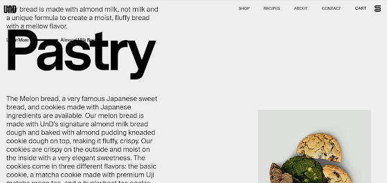
The overall design is
simple and elegant, mostly using contrasting colors, which can attract the eye
very well. When introducing food, they put the appearance of the food and put
cartoon pictures next to it. Realistic food patterns paired with unrelated
cartoon patterns will create a sense of fragmentation. Cartoon graphics are
incompatible with the overall style of the web page. The large titles of some
pages block the text introduction, making it difficult for people to read the
introduction clearly.
The functions are
simple and clear, and the location is conspicuous, so there is no need to spend
time looking for functions. The interactivity is not high. It is recommended to
add some interactions, such as search pages to facilitate product query. The
online shopping function also provides convenience to customers. In addition,
the privacy policy button cannot jump to another web page
The content is rich and the product
is introduced in detail. Provides many responses customers may need regarding
shelf life. It’s easy to learn more about their products.
The website runs smoothly, and there is
no lag when switching pages and text changes caused by sliding up and down.
An introduction to the layout, detailed
content, and references in contrasting colors can better capture people’s
attention.
The text on some pages is obscured, and
the cartoon illustrations are incompatible with the style of the web page.
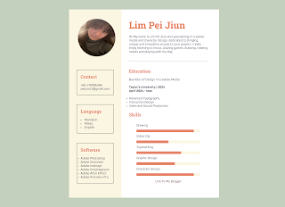
- Add your name as the main header at the top of the page.
- Write a short paragraph describing yourself, your interests, and any hobbies.
- List your most recent education details. Include the institution name, year, and course or program.
- Create a bulleted list of at least five skills you have (these could be related to school, hobbies, or any other talents).
- Add a simple contact section with an email address and a link to any social media profile (optional).
- Use different font sizes and weights to make sections and headers stand out.
- Choose a basic color scheme for the text and background. Use colors that are easy to read and look professional.
- Add padding and margins around each section to give your CV a clean, organized layout.
- Use borders or horizontal lines to separate sections for a professional touch.
- Add an image or profile picture at the top.
- Style your CV with a unique font and background color or pattern to reflect your personality.
- Create a folder for the task and include subfolder (images) and the HTML file in the folder
- Create a single HTML file for the content. Name the file as index.html
- Add the CSS rule within the head section
- Upload the folder to Netlify (I will show it in class)
- Embed the link into your blog and submit the post in Google Classroom


Comments
Post a Comment